Matplotlib is a widely adopted library among data scientists, engineers, analysts, and researchers in various fields such as finance, economics, physics, biology, and many others. It was initially built as a 2D graph generator with a similar structure to MATLAB, and since then, it has included new capabilities for creating static and dynamic 3D graphics.
This open-source library runs on Python and is designed to work with the SciPy stack and as a graphic extension to NumPy. It incorporates various plots, such as bar charts, line graphs, histograms, and scatter plots, offering a unique data representation method. It also allows users to create interactive figures (zoom, pan, and update) and export them to formats like EPS, PNG, PDF, and more.
If you are new to data visualization and want to learn more about this powerful tool, this blog post will provide you with the essential information to start with Matplotlib.
Matplotlib: A Tool for Anyone Who Works With Data Visualization
When you become a data analyst or a data scientist in a research group, one of your responsibilities will be to identify various types of data and then interpret them. It means you’ll have to retrieve and classify data from different sources, process and analyze it to draw conclusions, or even improve an organization’s performance.
Under that context, you must have critical-thinking skills and the knowledge of advanced tools to carry out your deductions processes. Matplotlib gives you the freedom and simplicity to create and interpret data without thinking about payments or use restrictions.
Some of its advantages are:
Easy Way to Represent Large Amounts of Data
As data analysts have to deal with large amounts of data, they also have to automatically represent it in accurate plots. For example, when modeling ML algorithms, intuitive images facilitate the analysis procedure, which helps to recover patterns and establish results.
Provides High-Quality Images
It enables users to create high-quality images in various formats, which can be useful for publications, presentations, and other professional applications. Some ways to enhance the quality of images include: adjusting resolution (set_dpi()), saving as vector graphics such as SVG and PDF, using different types of renderers like AGG or Cairo, and using the LaTeX extension for creating mathematical notation and symbols.
Suitable for Numerous Applications
Matplotlib plots can be used in interactive shells like IPython or web applications that employ frameworks such as Flask or Django, allowing them to be displayed as part of a web page. It is a suitable plotting tool for numerous applications in engineering, finance, health, education, and others due to its flexibility and versatility.
Large Community
Matplotlib is a free-to-use library with a large community. You can find many tutorials, examples, and other resources online to help you get started.
Supports Easy Customization in Various Plot Types
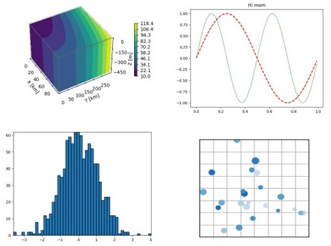
Matplotlib supports different types of data like arrays, fields (i.e., flow field, magnetic field), statistical data, and more. It provides a high degree of customization, allowing users to create a wide range of plots, including:
- 2D or 3D plots.
- Scatterplots.
- Bar charts.
- Animations (dynamic images).
Do You Want to Start? Here are the First Steps
The first thing to do is install the library. Matplotlib is already embedded into Jupyter Notebook, but for other IDEs, use the following command on your PC:
pip install matplotlib
or when using CODA:
conda install matplotlib
Once you have installed Matplotlib, employ the following command to import the library into your code:
import matplotlib.pyplot as plt
where plt is its standard alias. You can use others but remember that it is the most adopted and frequently seen in complex codes.
At this point, Matplotlib has provided you with two different ways or styles to generate new figures, each with its typing method.
- For the first one, called “Axes,” you must specify every step. In other words, begin your code with an instance for a figure class (.figure()), employ the subplot module (.subplot()) to create Axes objects, and finally print the figure (.plot()).
import matplotlib.pyplot as plt
Figure_1=plt.figure() # an empty figure with no Axes
Axes_1=Figure_1.subplots()
Axes_1.plot([-2, -1, 1, 2], [0, 1, 1, 0])
- The second and fast way to create a figure is through the pyplot module (plt.). It is equivalent to the Axes method but simplifies the procedure mentioned above.
import matplotlib.pyplot as plt
plt.plot([-2, -1, 1, 2], [0, 1, 1, 0])
Matplotlib and NumPy
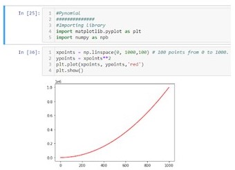
Let’s go a step further! Consider a scenario where you need to plot a second-order polynomial function. To do this, you must first generate the values for the x-axis and then numerically evaluate the function for each of those values. Use NumPy to create the array with the points for the x-axis and manipulate it according to the math operation. Check the code below, which illustrates this example.
import matplotlib.pyplot as plt
import numpy as np
xpoints = np.linspace(0, 1000,100) # 100 points from 0 to 1000.
ypoints = xpoints**2
plt.plot(xpoints, ypoints)
plt.show()
Matplotlib or Seaborn: What is the Best Choice?
Before comparing them, let me briefly talk about Seaborn. It is a library based on Matplotlib that provides a flexible API with a collection of classes to enhance data manipulation and visualization. Both Matplotlib and Seaborn have similar features but also have their advantages and disadvantages. Here are some important points about each of them:
Matplotlib
- It can be less convenient for working with data frames when using Pandas.
- Plots have a minimalistic style, which is ideal for scientific publications.
- Users have more advanced customization tools at their disposal.
- The syntax for creating some plots can be tedious and complex.
Seaborn
- It offers functions specifically designed for working with data frames, such as (pairplot).
- It has a more attractive default style for plots.
- The library has a more user-friendly API.
- Some advanced customization options may not be available.
Finally, the choice between Matplotlib and Seaborn depends on your specific needs and the type of project you are working on. Python users can also harness the power of both libraries for data visualization by using them together.