Plotly
The Plotly package is an excellent choice for anyone looking to quickly and easily create high-quality data visualizations. It offers a fast and convenient way to turn your data into compelling and informative figures.
Plotly was built with a suite of powerful modules, including plotly.colors, plotly.data, plotly.express, plotly.figure_factory, plotly.graph_objects, plotly.io, plotly.plotly. Combined, they allow users the creation of different types of static and dynamic graphs, such as scientific charts, 3D graphs, statistical charts, SVG maps, financial charts, and more.
Plotly vs. Matplotlib
Plotly and Matplotlib are both popular data visualization packages in Python, but they have some key differences:
- Plotly allows users to interact with the charts by zooming, panning, and more over data points to see extra information. Matplotlib, on the other hand, primarily creates static images, although some interactivity can be achieved using additional libraries.
- Plotly is generally easier to use and requires less code to create complex visualizations. With Matplotlib, the code becomes verbose, requiring extra arguments to achieve the same results.
- Plotly is optimized for web-based applications and is a better choice for creating visualizations that will be displayed on web pages. In comparison, Matplotlib is better suited for creating static images and is a better choice for creating visualizations that will be saved to files or printed.
- Finally, Matplotlib has been around longer and has a larger community, so it may be easier to find support and resources for learning. Plotly, while still well-supported, has a smaller community.
Quick Installation Guide
This very short tutorial will teach you how to install any Python package. Plotly is already installed in Jupyter Notebook. To verify and list all locally installed packages, use the following command:
pip list --format=columns
If the package is not already installed, run:
pip install plotly
And for Conda:
conda install -c plotly plotly
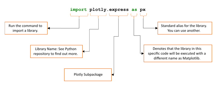
Once you have installed it, employ the following command to import the package into your code:
import plotly.express as px
where px is its standard alias and “.express” points out to a submodule. You can use others, but remember that it is the most adopted and frequently seen in complex codes.
Plotly Fundamentals
Creating a Line Chart
Plotly provides various chart types, including line charts, scatter plots, bar charts, pie charts, histograms, and more. Here is a simple example of generating an interactive line chart:
import plotly.express as px
import pandas as pd

# Create a sample dataframe with dates and corresponding values
df = pd.DataFrame({
    "Date": ["2021-01-01", "2021-01-02", "2021-01-03", "2021-01-04", "2021-01-05"],
    "Value": [100, 200, 150, 75, 250]
})

# Generate the line chart
fig = px.line(df, x="Date", y="Value", title="Daily Values")

# Show the chart
fig.show()
This code generates an interactive line chart that displays the daily values for the dates specified in “df.” The x-axis represents the dates, and the y-axis represents the values. The chart is labeled with the title “Daily Values.” When running this code, you can interact with the chart by zooming, panning, and hovering over data points to see the exact values.
Creating 2D Bar Chart
The charts generated using Plotly are highly interactive and allow the user to zoom, pan, and hover over the chart to get more information about specific data points. Use the “px.bar” function from the “plotly.express” module to generate a bar chart.
import plotly.express as px
import pandas as pd

# Create a sample dataframe with months and corresponding sales data
df = pd.DataFrame({
    "Month": ["Jan", "Feb", "Mar", "Apr", "May", "Jun"],
    "Sales": [100, 200, 150, 75, 250, 300]
})

# Generate the bar chart
fig = px.bar(df, x="Month", y="Sales", title="Monthly Sales")

# Show the chart
fig.show()
The bar chart can also be displayed in a different browser window.
# Show the chart in a different tab of web browser
fig.write_html('first_figure.html', auto_open=True)
The chart displays the monthly sales data for the months specified in the df DataFrame. The x-axis represents the months, and the y-axis represents the sales data. The chart is labeled with the title “Monthly Sales.” Please, refer to the video below for a demonstration of this example.
Creating Treemap Charts
A treemap chart is a type of data visualization that displays hierarchical data as nested rectangles. Each branch of the hierarchy is represented as a colored rectangle, and the size of the rectangle is proportional to the quantity of data being represented. In other words, treemap charts provide a way to visualize and compare the relative proportions of different hierarchical groups.
To create a treemap chart, you need to load your data and specify the hierarchical structure, and “plotly.express.treemap” will generate the chart automatically. You can customize the chart’s appearance by adjusting the colors, labels, and other elements.
import plotly.express as px
import pandas as pd

# Create a sample dataframe with product names, sales, and categories
df = pd.DataFrame({
    "Product": ["Apples", "Bananas", "Cherries", "Dates", "Elderberries"],
    "Sales": [100, 200, 150, 75, 50],
    "Category": ["Fruit", "Fruit", "Fruit", "Fruit", "Berry"]
})

# Create the treemap chart
fig = px.treemap(df, path=["Category", "Product"], values="Sales", title="Treemap Chart")

# Show the chart
fig.show()
In this example, the treemap chart shows the sales of various products categorized into different categories. The categories and products are displayed on the chart using a hierarchical tree structure, with larger rectangles representing higher sales values. Please, refer to the video below for a demonstration of this example.
Plotting Interactive Data on Maps
The “px.scatter_mapbox()” function in “plotly.express” is a convenient and easy-to-use tool for creating scatter plots on top of a map. It allows users to plot geographic data points on a map and customize the appearance of the points and the map itself. The function uses the Mapbox GL package to create the map, providing a fast and high-quality mapping experience.
To create a scatter plot on a map, you first need to load the data, including each data point’s latitude and longitude coordinates.
import plotly.express as px
import pandas as pd

# Create a sample dataframe with latitude, longitude, and city names
df = pd.DataFrame({
    "lat": [45.5236, 43.6532, 40.7128],
    "lon": [-122.6750, -79.3832, -74.0060],
    "city": ["Portland", "Toronto", "New York"]
})

# Create the first map with a scatter plot of cities
fig = px.scatter_mapbox(df, lat="lat", lon="lon", color="city", zoom=3)

# Update the layout to add a title and custom map style
fig.update_layout(mapbox_style="open-street-map", title_text="Scatter Plot Map")

# Show all the maps
fig.show()
In this example, the resulting figure is a scatter plot of cities with color representing the city name. Please, refer to the video below for a demonstration of this example.
Animations
Plotly also supports animations in its charts, which allows you to create dynamic visualizations that change over time. You can use the “animate” argument in various functions, such as “px.line”, “px.scatter”, and “px.bar” to specify the animation settings.
import plotly.express as px
import pandas as pd

# Create a sample dataframe
df = px.data.gapminder()

# Generate the animated bar chart
fig = px.bar(df, x="country", y="lifeExp", color="country",
             animation_frame="year", animation_group="lifeExp", title="Life Expectancy")

# Show the chart
fig.show()
This code generates an interactive bar chart that displays the relationship between country and life expectancy by country. The “lifeExp” values determine the bar height, while “country” names determine each bar’s color.
Ploty can also handle complex data such as those obtained by Magnetic Resonance Imaging (MRI) technique. The following code is an example of using an MRI image to plot it dynamically.
# Import data
import time
import numpy as np

from skimage import io

vol = io.imread("https://s3.amazonaws.com/assets.datacamp.com/blog_assets/attention-mri.tif")
volume = vol.T
r, c = volume[0].shape

# Define frames
import plotly.graph_objects as go
nb_frames = 68

fig = go.Figure(frames=[go.Frame(data=go.Surface(
    z=(6.7 - k * 0.1) * np.ones((r, c)),
    surfacecolor=np.flipud(volume[67 - k]),
    cmin=0, cmax=200
    ),
    name=str(k) # you need to name the frame for the animation to behave properly
    )
    for k in range(nb_frames)])

# Add data to be displayed before animation starts
fig.add_trace(go.Surface(
    z=6.7 * np.ones((r, c)),
    surfacecolor=np.flipud(volume[67]),
    colorscale='Gray',
    cmin=0, cmax=200,
    colorbar=dict(thickness=20, ticklen=4)
    ))

def frame_args(duration):
    return {
            "frame": {"duration": duration},
            "mode": "immediate",
            "fromcurrent": True,
            "transition": {"duration": duration, "easing": "linear"},
        }

sliders = [
            {
                "pad": {"b": 10, "t": 60},
                "len": 0.9,
                "x": 0.1,
                "y": 0,
                "steps": [
                    {
                        "args": [[f.name], frame_args(0)],
                        "label": str(k),
                        "method": "animate",
                    }
                    for k, f in enumerate(fig.frames)
                ],
            }
        ]

# Layout
fig.update_layout(
         title='Slices in volumetric data',
         width=600,
         height=600,
         scene=dict(
                    zaxis=dict(range=[-0.1, 6.8], autorange=False),
                    aspectratio=dict(x=1, y=1, z=1),
                    ),
         updatemenus = [
            {
                "buttons": [
                    {
                        "args": [None, frame_args(50)],
                        "label": "▶", # play symbol
                        "method": "animate",
                    },
                    {
                        "args": [[None], frame_args(0)],
                        "label": "◼", # pause symbol
                        "method": "animate",
                    },
                ],
                "direction": "left",
                "pad": {"r": 10, "t": 70},
                "type": "buttons",
                "x": 0.1,
                "y": 0,
            }
         ],
         sliders=sliders
)

fig.show()
Source: Plotly examples
Please, refer to the video below for a demonstration of this example.
Highlights
Project Background
- Project: Plotly
- Author: Author: Alex Johnson, Jack Parmer, Chris Parmer, and Matthew Sundquist
- Initial Release: 2015
- Type: Plotting
- License: MIT License
- Contains: Data visualization modules and figure converters.
- Language: Python
- GitHub: /plotly/plotly.py
- Runs On: OS-agnostic
- Twitter: /plotlygraphs
Main Features
- Plotly offers a suite of powerful modules, including plotly.express, plotly.data, and plotly.color, allowing users to effortlessly create interactive charts with personalized style and color options, all while having access to a vast array of datasets.
- Plotly is highly versatile and can handle a wide range of data formats, including lists generated from Pandas DataFrames, arrays from Numpy, and geographical information from GeoPandas.
- It automates the figure labeling on axes, legends, and color bars.
- Some functions allow users to automatically switch between continuous and categorical colors based on the input type.
- The module “plotly.scatter” allows the creation of trendlines based on the DataFrame.
- The “animate” argument allows the creation of dynamic visualization in plots like charts, scatters, and lines.
- The “.express” module provides the WebGL function for increased speed, improved interactivity, and the ability to plot even more data.
Prior Knowledge Requirements
- Knowledge about data structure and how to represent it in a visual format.
- Basic knowledge of programming languages, preferably Python.
- This Python tool is a web-based package, so having some knowledge of HTML, CSS, and JavaScript could be helpful.
- Familiarity with standard data visualization techniques, such as bar charts, line graphs, and scatter plots.
Community Benchmarks
- 12,900 Stars
- 2,300 Forks
- 191+ Code contributors
- 70+ releases
- Source: GitHub
Releases
- V5.13.0 (1-2023): Update and Fixes: e.g., write_html() now explicitly encodes output as UTF-8.
- v5.12.0 (10-17-2022): Update and Fixes: e.g., Fixed bug for trendlines with datetime axes
- V5.11.0 (10-17-2022): Update: e.g., Add clustering options to scattermapbox
- V5.10.0 (8-11-2022): Update: e.g., Add support for sankey links with arrows
- v5.9.0 (6-23-2022): Update: e.g., Allow non-string extras in flaglist attributes, to support upcoming changes to ax.automargin.
- Source: releases.
References
[1] GitHub
[2] Documentation